
I am a visual person and don't do well following written instructions, but I have received so many requests for a written tutorial of this technique that I felt I needed to do this too.
The first thing you need to do is decide on your text and image.
Certain letters work better than others. For example, the letters P, F, C, J, K, T, V and Y don't work very well so you will want to use words that do not have these letters in the middle. Other letters like A, E, G, O and U are also a bit tricky.
Obviously, sometimes you have no choice but to use these letters. This is why it is best to use images that don't have too much detail. In the PANTHER PRIDE example above, the letter T is right in the middle of the word, but it still works well because the image is solid enough.
Notice the gap between the P and R in the 2nd word. That would be a problem if the P were in the middle of the word, but since it's at the end and the image doesn't reach that far, it doesn't matter at all.
You will need to manipulate your letters and image to make it work well.
You can click any of the images below to display larger versions.

Impact font works very well because it's a nice chunky font that fills in very well.

I stretched out my text as large as possible on my mat to make it easy to see everything.
I need to make sure my letters fit nice and closely together (kerning) and that the lines are nice and snug too.


With your text selected, right click and choose Ungroup.


Group your top words together.


At this point, drag your text wider or taller until you are happy with the look. It won't look perfect because this is not good spacing for reading. You will need to imagine how the text will look once you add the image.

Once you are happy with the text, turn off the grid and group both lines by selecting the two lines, right clicking and selecting Group.
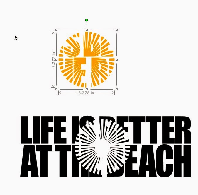
Now I will need to select the image I want to use. I have decided on using an image that looks like the sun.

The image above shows you the icons for changing the fill colour, which is the paint bucket, and the line icon to change the colour of your lines.

I have placed the sun on my text, but if you look closely, you will see that there is quite a gap where the 2 letter Ts are in the word BETTER.

Before you move on to the next step, be absolutely sure that all of your text is grouped together. The technique will not work if your text is not grouped together.
 |
| Make sure your shape is on top of your text. Group your text and the shape. |
 |
| Copy the grouped items to your clipboard |
 |
| Paste to make a 2nd set |
 |
| Move the 2nd set away from the first |
 |
| Ungroup the first set only once. Remember your text must remain grouped. |
 |
| Ungroup the second set only once as well. |
 |
| With the first group selected, open your Modify window. Choose Crop. |
 |
| Dont' panic |
 |
| With all those parts selected, right click and choose Group |
 |
| This is how it will look once it's grouped |
.jpeg) |
| With the second set selected, choose Subtract |
 |
| Don't hyperventilate. With everything selected, right click and choose Group. |
 |
| It will look like this. |
 |
| I changed the colour of the sun portion so you can see the parts. |
 |
| Move the sun portion into place and then Zoom In |
 |
| Now you can easily move the shape where it should be. |

You're done.
You can also follow along with my video. In my video, I also show you how to create registration marks so you can cut the layers separately and line them up once they are cut.
Note that if you would like me to create a file for you, you can request a Custom design here.


Thanks Karin.
ReplyDeleteBlessings Jocelan
Thank you for doing these written instructions. I have a bad memory and need to refer back a million times, so this will help me alot!
ReplyDeleteI do have a question though. I want to put the words "ROLL TIDE" down the side of my grandsons paint leg. Then I'd like to do a knockout of his name out of the ROLL TIDE. Can that even work?
Thanks so much,
Barbaralee
No, text on text won't work. Sometimes with images, it's hard to see, but text definitely won't be legible. Another tip for the images is that you should use colours with a lot of contrast to make sure the image is very visible.
DeleteThank you for such a wonderful tutorial ! I was able to follow along, step by step, to create my (almost perfect) design. Super easy to follow along ! I know I will keep this for reference every time I create something using this technique !!! Now onto cutting ... LOL
ReplyDeleteThank you so much for writing. It took many hours to put this together and I'm so happy that you found it easy to follow along.
DeleteThis comment has been removed by the author.
ReplyDeleteI have worked for days watching a video and trying to write it up. Your awesome. So much easier to do with the written insturctions.
ReplyDeleteThank you so much. You're very kind. I have moved my blog. You should go here http://scrappydivablog.com/
DeleteAll my new posts are there, plus the old ones.